<!DOCTYPE html>
<html lang="en">
<head>
<meta charset="UTF-8">
<title>audio</title>
</head>
<body>
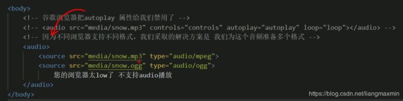
<audio controls="controls">
<source src="video/Light.mp3" type="audio/mpeg">
<source src="video/Light.ogg" type="audio/ogg">
您的瀏覽器太low了
</audio>
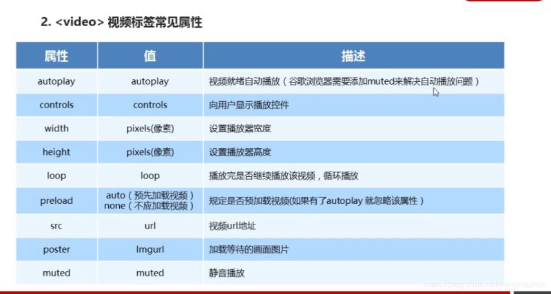
<video controls muted poster="img/1.png" width="300px" height="300px">
<source src="video/Light.mp3" type="video/mp3">
<source src="video/Light.mp3" type="video/ogg">
您的瀏覽器太low
</video>
<form action="">
<ol>
<li>郵箱:<input type="email"></li>
<li>網(wǎng)址:<input type="url"></li>
<li>日期:<input type="date"></li>
<li>數(shù)量:<input type="number"></li>
<li>日期:<input type="time"></li>
<li>手機(jī)號(hào):<input type="tel"></li>
<li>搜索:<input type="search"></li>
<li>顏色:<input type="color"></li>
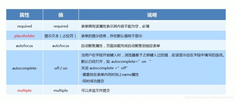
<li>不能為空:<input type="text" required="required"></li>
<li>提示為本:<input type="text" placeholder="啦啦啦 我是賣(mài)報(bào)的"></li>
<li>自動(dòng)獲得鼠標(biāo)焦點(diǎn):<input type="text" autofocus="autofocus"></li>
<li><input type="text" autocomplete="on" name="autocomplete"></li>
<li><input type="submit" value="提交"></li>
</ol>
<hr>
</form>
<form action="">
<ul>
<li><input type="file" name="" id="" multiple></li>
<li><input type="submit" value="提交"></li>
</ul>
</form>
</body>
</html>
<!DOCTYPE html>
<html lang="en">
<head>
<meta charset="UTF-8">
<title>css3</title>
</head>
<style>
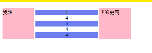
ul li:nth-child(odd) {
background-color: cornflowerblue;
}
ul {
display: inline-grid;
width: 200px;
margin-left: -39px;
list-style: none;
text-align: center;
}
div::before {
display: inline-block;
content: "我想";
width: 100px;
height: 100px;
background-color: pink;
}
div::after {
display: inline-block;
content: "飛的更高";
width: 100px;
height: 100px;
background-color: pink;
}
</style>
<body>
<div>
<ul>
<li>1</li>
<li>4</li>
<li>4</li>
<li>4</li>
<li>4</li>
</ul>
</div>
</body>
</html>
<!DOCTYPE html>
<html lang="en">
<head>
<meta charset="UTF-8">
<title>動(dòng)畫(huà)</title>
</head>
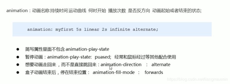
<style>
/*from 和 to 等價(jià)于 0% 和 100%*/
/*@keyframes move {*/
/*0%{*/
/*transform:translateX(0px);*/
/*}*/
/*100%{*/
/*transform:translateX(1000px);*/
/*}*/
/*}*/
.bowen {
position: fixed;
top: 50%;
left: 50%;
width: 200px;
height: 200px;
transform: translate(-50%, -50%);
background-color: pink;
}
.bowen div[class^="dotted"] {
position: absolute;
top: 50%;
left: 50%;
width: 8px;
height: 8px;
transform: translate(-50%, -50%);
background-color: deepskyblue;
border-radius: 50%;
}
@keyframes pulse {
0% {
}
70% {
width: 100px;
height: 100px;
opacity: 1;
}
100% {
width: 100px;
height: 100px;
opacity: 0;
}
}
.bowen div.dotted2,
.bowen div.dotted3,
.bowen div.dotted4 {
background-color: transparent;
box-shadow: 0 0 8px deepskyblue;
animation: pulse 1.2s linear infinite forwards;
}
.bowen div.dotted2 {
animation-delay: 0.4s;
}
.bowen div.dotted3 {
animation-delay: 0.8s;
}
</style>
<body>
<div class="bowen">
<div class="dotted1"></div>
<div class="dotted2"></div>
<div class="dotted3"></div>
<div class="dotted4"></div>
</div>
</body>
</html>

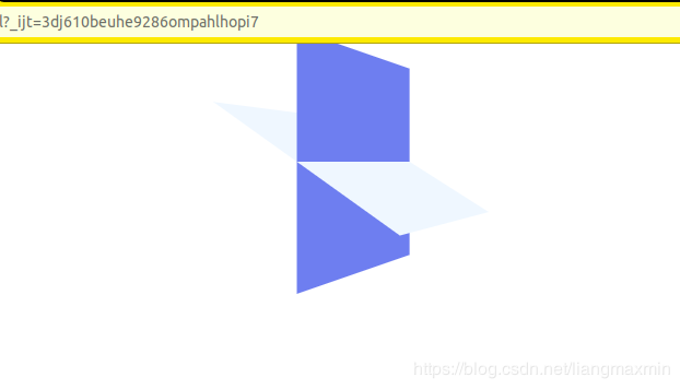
<!DOCTYPE html>
<html lang="en">
<head>
    <meta charset="UTF-8">
    <title>3D</title>
</head>

<style>
    body {
        perspective: 500px;
    }

    .box {
        position: relative;
        width: 200px;
        height: 200px;
        margin: 0 auto;
        transform-style: preserve-3d;
        transition: all .3s;
    }

    .box div {
        position: absolute;
        top: 0;
        left: 0;
        width: 100%;
        height: 100%;
        background-color: cornflowerblue;
    }

    .box div:last-child {
        background-color: aliceblue;
        transform: rotateX(60deg);
    }

    .box:hover {
        transform: rotate3D(0, 1, 0, 60deg);
    }

</style>

<body>
<div class="box">
    <div></div>
    <div></div>
</div>
</body>
</html>
<!DOCTYPE html>
<html lang="en">
<head>
<meta charset="UTF-8">
<title>導(dǎo)航欄</title>
</head>
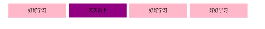
<style>
li {
float: left;
padding: 0 10px;
list-style: none;
perspective: 500px;
}
.box {
position: relative;
width: 200px;
height: 50px;
transform-style: preserve-3d;
transition: all .5s;
}
.box div {
position: absolute;
top: 0;
left: 0;
width: 100%;
height: 100%;
background-color: pink;
text-align: center;
line-height: 50px;
}
.box div:nth-child(1) {
transform: translateZ(25px);
}
.box div:nth-child(2) {
background-color: purple;
/*必須先移動(dòng)后旋轉(zhuǎn)*/
transform: translateY(25px) rotateX(-90deg);
}
.box:hover {
transform: rotateX(90deg);
}
</style>
<body>
<ul>
<li>
<div class="box">
<div>好好學(xué)習(xí)</div>
<div>天天向上</div>
</div>
</li>
<li>
<div class="box">
<div>好好學(xué)習(xí)</div>
<div>天天向上</div>
</div>
</li>
<li>
<div class="box">
<div>好好學(xué)習(xí)</div>
<div>天天向上</div>
</div>
</li>
<li>
<div class="box">
<div>好好學(xué)習(xí)</div>
<div>天天向上</div>
</div>
</li>
</ul>
</body>
</html>
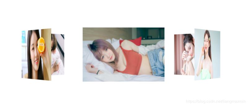
<!DOCTYPE html>
<html lang="en">
<head>
    <meta charset="UTF-8">
    <title>旋轉(zhuǎn)木馬</title>
</head>
<style>
    section {
        position: fixed;
        top: 50%;
        left: 50%;
        width: 300px;
        height: 200px;
        transform: translate(-50%, -50%);
        perspective: 2500px;
    }

    section div.box {
        position: relative;
        transform-style: preserve-3d;
        animation: move 15s linear infinite;
        background: url("img/4.jpg") no-repeat;
        background-size: 300px 200px;
    }

    div {
        position: absolute;
        top: 0;
        left: 0;
        width: 100%;
        height: 100%;
    }

    div:nth-child(1) {
        background: url("img/3.jpg") no-repeat;
        background-size: 300px 200px;
        transform: rotateY(0) translateZ(400px);
    }

    div:nth-child(2) {
        background: url("img/9.jpg") no-repeat;
        background-size: 300px 200px;
        transform: rotateY(60deg) translateZ(400px);
    }

    div:nth-child(3) {
        background: url("img/5.jpg") no-repeat;
        background-size: 300px 200px;
        transform: rotateY(120deg) translateZ(400px);
    }

    div:nth-child(4) {
        background: url("img/6.jpg") no-repeat;
        background-size: 300px 200px;
        transform: rotateY(180deg) translateZ(400px);
    }

    div:nth-child(5) {
        background: url("img/7.jpg") no-repeat;
        background-size: 300px 200px;
        transform: rotateY(240deg) translateZ(400px);
    }

    div:nth-child(6) {
        background: url("img/8.jpg") no-repeat;
        background-size: 300px 200px;
        transform: rotateY(300deg) translateZ(400px);
    }

    @keyframes move {
        0% {
            transform: rotateY(0);
        }
        100% {
            transform: rotateY(360deg);
        }
    }

    .box:hover{
        animation-play-state: paused;
    }


</style>
<body>
<section>
    <div class="box">
        <div></div>
        <div></div>
        <div></div>
        <div></div>
        <div></div>
        <div></div>
    </div>
</section>
</body>
</html>
總結(jié)
到此這篇關(guān)于html5簡(jiǎn)介及新增功能介紹的文章就介紹到這了,更多相關(guān)html5簡(jiǎn)介新增功能內(nèi)容請(qǐng)搜索腳本之家以前的文章或繼續(xù)瀏覽下面的相關(guān)文章,希望大家以后多多支持腳本之家!
